Poster Paint Phase
In my 10th grade year I got a poster paint phase. During 10th grade the most important project of the year is the MYP project, the Personal Project. Well Bingo, my personal project was about art. It was about designing an energy-drink campaign based on the Coca-Cola vintage advertisements. So I created my own energy-drink bottle, logo, name, and overall advertisement. This was a long process, in which I had to design the bottle and everything to make the campaign. To do this, I observed all the details of the Coca-Cola vintage advertisements and saw that, for instance, they used famous faces in their ads, like Amelia Earhart and the ultimate Santa Clause icon. So I decided to use Elvis Presley as my face. With all the principles of my campaign decided, I had to ponder a lot and create a lot of different options in an A3 sketchbook until I was satisfied with my product, an advertisement done in canvas. To do all these sketches, I used poster paints, easy, smooth and bright.
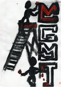
My poster paint phase included sketches for art class and sketches done in my free time, but they all had one thing in common, (apart from being done in poster paints) they were not perfect. This is why I like poster paints so much, because they create an imperfect effect but still it looks classic and detailed.
This Coca-Cola sketch is imperfect but super cool, my favorite. In this sketch I include a very realistic Coca-Cola can done with all the details, yet I distort its reality. The little man pushing the can distorts the reality of the can, and makes Coca-Cola seem bigger.
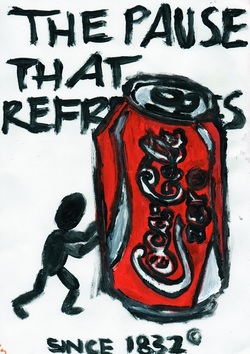